Showing posts with label art wall. Show all posts

Multiple gallery walls in one space: issues to consider

Are you ready for more art wall proselytizing?  Well, here we go.

I recently framed and installed 30-some pictures from a local photo contest in the Mendota Heights City Hall.  The municipal building had lots of bare walls, and most of the art that was up had the sort of muted color and generic subject matter that I associate with this hotel art fire sales.  Remember those?

Here's the before:


To bring some life to the space aesthetically as well as a sense of community, they brought me in to make the most of what they had: photographs of their city taken by its citizens.

We decided to go very simple on the frames, and to have all the frames match.  This brought unity to the project and simplifed my job by eliminating one of the major elements to consider (balancing the tones and types of frames in a mixed arrangement),  but the project still had plenty of useful lessons.

1. Groupings should have the same overall height


Just as in furniture arranging, you want to bring the eye around the room in an even, measured way.  Groupings that live at very different heights will create a visual rollercoaster.  In this space, despite a mix of horizontal and vertical arrangements, I made sure that the groupings maxed out at the same height.  This can apply to single pieces in a room or throughout a house where sitelines run from room to room.  When you create a standard height this way, hanging something very low or very hi can be quite fun and unexpected.

2.  Repetition creates rhythm


In a big space like this, there are two viewing experiences: first, the graphic impression of the frames, then the more intimate viewing of the content.  To create a sense of rhythm in the frames,  you can riff on one arrangement in another.  In this case, the arrangement by the front door has three horizontal frames flanked by two verticals, and this relationship is inverted in the grouping over the chairs, which has two vertical frames flanked by three horizontal.

3.  Contrast restful and energized arrangements


The photo contest had three winners in each of three categories.  To delineate the honor, we blew up the winning photos to 8x10.  Originally, I planned to mix the larger and smaller frames, but once I got them all onsite I realized that I had too many to fit on the three walls we had planned to use, so we made a "hall of winners," top.  The arrangement, determined by the orientation of the nine photos I had to work with, feels quite energized.  To calm the eye, I did a straight grid of 6 horizontal images on the adjacent wall.

4. Subject matter/ placement
The content of the photographs in this case fell mostly to two categories: scenic images of nature, and pictures of people and animals.  The scenic pictures could be enjoyed from a distance, but it's human nature to want to see pictures of people and animals that we might know much closer up.  In this case, I grouped the scenic pictures over the chairs, where there is no access to get up close, and placed the images of people and pets over the bench by the conference room, which invites people to take a closer look.

Lots to think about, but when you know the principles to follow, it all gets a little easier.
Also goes to show that you can create a dramatic gallery wall (or group of them) without spending a ton of cash.  They already had the photos, and we used the ReStyle frames from Target, which are about as inexpensive as you can get.  When hung en masse, they have a custom look, don't you think?

If you would like help creating a custom gallery wall in your home or office, email me at heather@heatherpetersondesign.com to inquire about rates.

Art Wall like Kudzu

I'm a huge fan of the Art Wall, no surprise.  I did a tutorial way back when, before I even had this blog and the decorating posts were taking over the mom blog.  In addition to the new one in my bedroom, I recently installed this one, and this one, and my daughter got in the action with this one, and hey, I'm finishing up an installation in Mendota Heights City Hall today.  Pictures to come on that.

I think this is one of the quickest ways to bring personality to a space and to conquer a large wall, like this one in my office.


But I wonder when one crosses the border into too much of a good thing?

More Apartment Therapy references.  This London home was featured last week, and I found myself completely fascinated by the way they have incorporated their collections into their home.  (I also find this useful as I am working with someone with AMAZING collections from all over the world, displayed in her home).


And I'm kind of digging the way the gallery wall has just taken over....everything...in the kitchen....


And I can admire the way the installation kind of masks practical things, like the spice rack.


But at the same time, I'm a maximalist who likes a little breathing room for the eye every now and again.  Amazing how three pictures in a hallway feel so loose and breezy after the density in the kitchen.


What do you think:  Art on the cabinets, yay or nay?


Art without borders, love it or hate it?

Clio's Art Wall

This weekend, my 4 year old played "art gallery" with her 7 year old cousin at my mom's house.

I drew a couple of "faux bois" wood frames,


and Clio used those mixed in with some "stretch canvases."  After busily drawing for a while, she announced she needed the tape, then proceeded to hang the installation herself, except for the top edge of the higher pieces, which required the long arm of a grownup.  Namely, me.


I had nothing to do with the layout, I was really just a tape applicator.  All in all, I'm quite impressed by my budding little artist and curator--I'd say she's a natural!

Oh, and in case you're confused about what you're looking at, this is my mom's 4-season porch, and that brown vinyl cover is over a hot tub (which hasn't functioned in years).  The glass windows look into the kitchen.  And that framed poster of some koi probably went in as a placeholder 20 years ago, and there it is today.  Isn't it amazing how that happens to us all?

Do your kids take after you when it comes to their play and activities?

Rebecca's Family Gallery Wall

Gallery walls are quickly becoming my favorite thing to do. There's something especially fun about making them for other people, and I got to arrange one for Rebecca last week.

I think we get to a point with our own artwork or photographs where we only see them in one certain way, and an outside eye can bring the images together in a fresh way. For a gift to our parents on the occasion of our wedding, my husband and I wanted to make a photo book of our life together up to that point. Because we were planning the wedding in just 3 months, and long distance to boot, we were a little short on time for side projects (no shotgun or anything, I just waited a long time to get engaged and didn't want to plan a wedding for two years). So my lovely aunt Missy stepped in and put the book together for us. I love looking at it because it tells a different story of Dave and I than the one I would have constructed, and I love having this other vision. Of course, it didn't hurt that Missy has a great eye--she is a phenomenal photographer, and you can see her work here.

Rebecca has a beautiful midcentury split level in which she says she has had an aversion to hanging things on the walls. But she is also nesting as she awaits baby number three, and she is digging into some long-awaited projects. Her upstairs hallway is a long, blank slate, and it is visible from the front hall and the living/dining room. We looked at the work she wanted to use and discussed the types of frames that would work best (and complement what she already had). After she took several trips to Michael's, we got down to business. (One more aside: Michael's has a coupon for 40% off frames, today through Saturday. If you want to tackle a project like this, now is a great time!)

The first arrangement:


My first instinct was to center around the largest piece and the one strong horizontal frame, with everything sort of fanning out from there. We loved this, but then realized it might read as off-center because the wall we were hanging it on is not centered on the stairway that leads up to it.

So I started taking it apart to build it around two strong central vertical columns. With two "centers," the arrangement will look right from any vantage point. (Rebecca blogs too, a family blog you can read here. Hence the photos of me in action!)


The goal was to keep everything balanced: photos with artwork, old photos and new, ornate frames and simple, copper tones and silver, horizontal and vertical, divided mattes and singletons. Rebecca said it was like a game of Tetris. Indeed.

Because there were so many small pieces, we laid the whole arrangement out on craft paper and traced and labeled each frame, which is a little different from my usual technique. This way, we could play around with the placement of the entire arrangement on the wall without moving dozens of individual papers.


Then we hung the pieces in their individual spots, tweaking as we went. (Normally I wouldn't leave a hole in the center like that, but one key frame was being spraypainted and was not yet dry.)


We chose a tight arrangement with the frames hugging closely together, both for a stronger impact with the smaller pieces (lots of 4x6 and 5x7 frames), and to leave room for Rebecca to expand the wall over the years.

To keep some sense of order, we created pairs where possible, like the two horizontal copper frames on the left below, with 2 photos each,


And broke up the angularity with some tiny little ovals, bottom right.


I have to say, I LOVE the way this turned out! It feels like such a modern way to display family photos, both old and new, and I love that Rebecca mixed in some artwork that was personal to the family.

Everyone has great pieces in their home that can be grouped to make a statement. If you'd like help creating a gallery wall in your home, please contact me at heatherjoypeterson@gmail.com for details.

Art Wall: Done!


Got the actual art pieces hung this weekend, which included going into my husband's stash of prints to supplement what I already had--he's an awesome photographer, when he feels like it. The room is actually feeling finished, which feels great: perhaps the first (almost) finished room in the house.

This wall is a prime example of the whole being greater than the sum of its parts (is that the right expression? sounds backwards, somehow.) These are pieces that I have collected or made over the years, and while each is personal, I likely wouldn't choose them today, as most of them are not exactly wowing on their own with the possible exception of the Brad Harrison photograph--the largest, middle one of a woman standing on a rock in the water. He's an amazing photographer and this print was a gift for a shoot I produced with him for an insurance company back in the day. It's lovely, and serene, and this is the first time it is not hanging on its own in a bathroom.

I think the reason this grouping works is that each piece is figural and predominantly black and white. So even though the eras and styles are all over the map, there is a logic in the subject matter and an overall cohesiveness by tone. For me, when using figures, it's important to think about where they are facing, and no one here is gazing awkwardly into space...so that's something, right? I always think that people in a group of images like this should be looking inward, rather than "out of scene" or "off stage," but sometimes you can do that on purpose to interesting effect. Here, the girl in the orange and black deco piece at the top is coming through the curtains and gazing out the window.

I think you also need to think about balance. In this case, I wanted to balance figures with portraits (bodies with heads) and black and white with the images that have some color. I also wanted to balance the frames in terms of color and levels of detail.

Anyway. Boring. If you really want more on what works in gallery walls (in my opinion), check out this post.

But mostly, here's what's nice: I walk into the room and it feels finished. Except for the pile of crap all over our dressers. Maybe we'll clean those up and take a picture and post it here for posterity.

Caution: Art Wall in Progress

To be honest, I was feeling a little reluctant to create a second full-scale art wall in the house. This one is already a major statement in the office (more on that here)


but the truth is we have lots of little pieces and lots of BIG blank walls, so you do the math. Typically, if someone insisted on two (or more) gallery walls in one house, I would recommend two different styles. Probably one more free form like my office and one sort of regimented, a big grid of matching frames. But I don't have the pieces for that. So I suppose I'll have to settle on one wildy colorful and one mostly black and white.

Anyhoo.

I got things all mocked up in the master bedroom, and asked my husband to approve the layout before I got to putting all those nails in the walls.

(I decided to incorporate the floor lamp, and keep things high enough to accommodate a possible future occasional table between the chairs.)

You know what he said? He likes it just like this. Brown paper, blue tape.

He is more avant garde than I.

I can see from these photos that I need to adjust the spacing just a bit. Probably just as well: I try to hold off on hammering while the kids are asleep.

Terry's Formal Art Wall

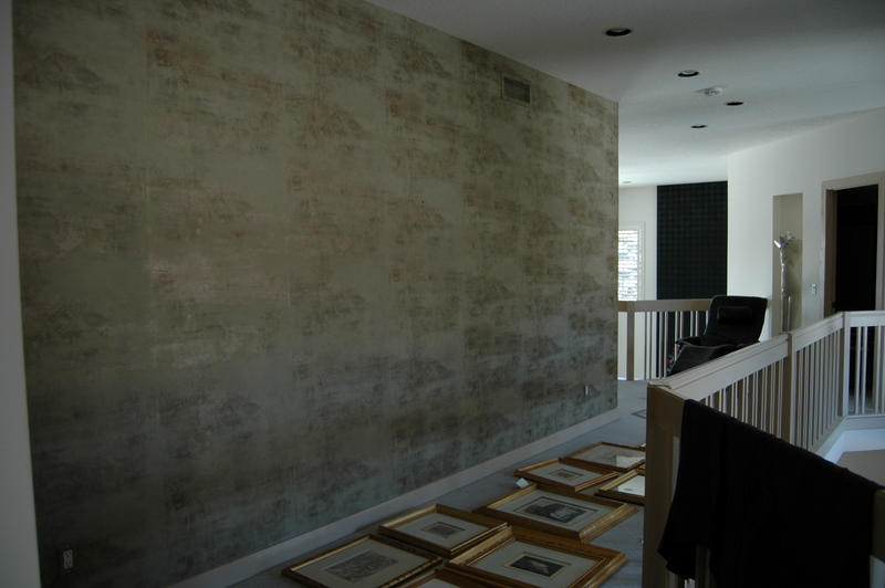
After what turned out to be a months-long process, I finally got this art wall hung last week, and I'm thrilled to share the results! (I couldn't post the pictures right away because it was a surprise for the homeowner, my mom, and I didn't want her to see photos before she saw the wall in her house.)

My parents' house is big and open and airy, and the wall in question is the second level hallway, overlooking the foyer, which has double-height ceilings. It is a big wall, making it both an opportunity and a challenge as far as a gallery goes, especially since the vantage point for seeing it is sort of awkward: you encounter it as a whole coming up the stairs, but when you are actually IN the hallway you are too close to the wall to see it as a whole. Here's the before (with the final work lying on the floor--oops):


We set the scheme based on a group of 5 etchings, already framed in gold, by early 20th century artists, which were mostly in storage or hung individually elsewhere in the house. The idea was to make a strong impact through a tight arrangement of gold frames, which you would see coming up the stairs, followed by the more intimate experience of seeing these delicate works up close, one by one.

To accomplish this, we gathered a number of other black and white works with delicate lines, but we needed to do some serious frame makeovers.

Check out the line drawing of the Madonna, framed in gold with a green velvet border. And that pair of Chinese etchings in skimpy little nothing frames.


The drawing of the Virgin belonged to my dad's mother, and we did her up right in a graceful frame and gold fillet, and gave the Chinese pieces much more oomph with a heavier gold bamboo frame. To go with the old-world feel of the original pieces, all the new frames got ivory silk mattes.

Finally, we broke up all the works-on-paper with portraits of my grandparents. My mom had wallet-sized photographs, so we needed to have them reproduced. I stumbled upon a place in Stillwater that specializes in antique photographs, and they did a great job with these (though it took FOREVER). You can see the pictures of my grandfather above and my grandmother, below, post reproduction and framing. I am generally a fan of mixing in the personal when doing a gallery wall in your own home, and think these photos were a great addition here.


To get the formal effect we were after, we figured out the best overall layout, which is very symmetrical, and then decided on completely even spacing between the pictures--2 inches all around. This meant that my usual method of hanging a wall wasn't really necessary: we simply had to figure out the overall placement of the arrangement, hang the center picture, then do a lot of math to hang the rest.

For placement, we taped together two sheets of kraft paper in the overall dimension of the arrangement, and used putty to put the whole thing on the wall. (Thankfully, my aunt was helping me, because that was one BIG sheet of paper, and it did NOT want to stay up on the wall!). Once it was set and the middle picture hung, we simply had to calculate the position of each subsequent nail, the details of which are super boring (but also kind of impressive) and took us forever to figure out, so I will not (further) bore you here.

Anyway, I think the results are truly spectacular (too much? Okay, well, it's real pretty), and my mom was sooooo pleasantly surprised when she came home from two weeks in Arizona to find this long-empty wall DONE.

Here's the same vantage point as the before shot:

And here's a closer look. Or two.


The whole is definitely greater than the sum of its parts, and I'm loving it.


Have a boring wall? Want to make it beautiful? I'd love to help. Email me at heatherjoypeterson[at]gmail[dot]com for services and rates.

How to Hang an Art Wall

My first job out of college, I worked for a downtown boutique advertising agency, assisting, and then becoming, the Art Buyer, the person who works with the creative teams and finds the right photographer or illustrator to realize their vision for a print campaign. Photographers like to work editorial assignments for the artistic freedom and the recognition, but they like to do commercial shoots for the big budgets and better fees, so Art Buyers tend to become friends with photo agents and known to agencies. This is all a lot of background to say that when I was about 23, I got a call from Magnum, an elite agency representing the world's best photo journalists, asking to meet with me about hanging a show of Burt Glinn's work at the ad agency. The agent and the photographer came in with a collection of prints from his work in Cuba in the 1960s, and as we worked out a plan to arrange the work, I began to see clearly how a wall of art prints could tell a story, and the way the narrative changed as we created different juxtapositions.

On the day they came to install, I learned a thing or two about the practical aspects of hanging a group of works, the actual nails and measuring, and I have now put the tips into practice in three houses and several arrangements, like this one in the dining room in Boulder.


When we moved into our new house, I had an immediate vision for a wall of art in the office, a more private room tucked away at the back of the house, where there was one large, blank wall. Because the scale of the wall was much larger than the ones I had worked with before, I knew it would take some careful planning. Now, there are entire books on the subject of hanging art displays, but I believe it is largely instinctive, a matter of personal preference in terms of both the aesthetics and, more importantly, what story you want to tell. Apart from feeling it out, there are a few steps that work for me. (You can do this in just a couple of hours, and it's really fun).

1. Choose your work

Most people don't have endless works of art to choose from. When making a grouping, you may just want to use everything you have--you chose each of the pieces, you can probably make them work together. If you do have more to choose from, look for commonalities that tie a group together, whether a color scheme or a subject theme. If there's no theme within the works, you probably want to limit yourself to one medium, say photographs, oil paintings, or works on paper. If all your pieces relate to the ocean (to choose a subject at random), you can much more easily mix a watercolor and a photograph. Keep in mind that the frames are a visual element, too. Some people will suggest framing everything uniformly, but I say, not necessary. You can use uniform frames as a way to make a statement- I once saw a long hallway filled with black and white photographs all framed in red, which packed a totally chic punch- but the general rule of thumb is to choose a frame that is right for the piece, not for a grouping or your room.

2. Plan your composition

This is the fun part. Take all the pieces your thinking of using, and lay them out on the floor. Move them around until it feels like they fit. I usually start with the largest piece, which I like to put somewhere near the middle for weight, and then let the smaller pieces radiate out from there.


I also think about balance in terms of light and dark, both in the piece and in the frame material, and the density of the image versus the amount of negative space. With a very large wall or a lot of pieces, it's also a good idea to think about creating pockets of order within the larger composition- incorporating pairs or using symmetry in placement, as I ultimately did here in the office.


With fewer pieces, you can create a sense of energy by playing against symmetry. Our final grouping in our Brooklyn dining room had three pieces hung "too high"- not everyone's cup of tea, but in the end I found it more interesting than if it was completely balanced. (And, i will admit, a happy accident-I used existing nails from a previous grouping for one or tow of the pieces on the right, and then just went with it.)


3. Mock it up

Once you have your arrangement set, take a picture: you'll need it for reference later. (It's also helpful to do this while planning your composition- you see things in the photograph that you may not see looking directly at the arrangement.) Now trace each piece on butcher paper, cut them out, and label them. With smaller walls I have generally skipped this step, though the results vary. In our Boulder dining room, one half of the arrangement ended up all scrunched up while the other half had more breathing room between pieces. Oops! I had to swap in a bigger piece on the left to make it feel more balanced.


When you have all your paper cut, refer to your photo and begin adhering the paper to the wall, using some of that sticky tack that won't leave a mark on the wall. It's a good idea to measure the overall dimensions of the arrangement in order to place the first piece on the wall, but eyeballing it should get you pretty close, too (I'm definitely an eyeballer). This is also a good chance to make any adjustments based on what you see in your photos from the floor layout. In our office, I realized that the little square piece at the top of the grouping was too disconnected from the piece around it when centered; I moved it off center towards the other square piece, and I like the energy this ended up giving things.


4. Hang it!

Take a picture of the mock up, too, and use it to finalize things. Without the distraction of the color in the artwork, you might see some wonky things in the layout. In our office, I didn't end up liking the single piece way on the right,kind of hanging out alone, and simply nixed it from the scheme. Make any final adjustments to the mock up, and get ready to hang. Measure the distance from the wire on the back of each piece to the top of the frame, then measure down from the top of the butcher paper to mark the spot for the nail or picture hook. Measure across the paper, too, to find the center. You can pound the nail in and then remove the paper, but if you want to save the paper for another use (fingerpainting!), I recommend hammering the nail in just enough to make a mark, then removing the paper and finishing up with the nail. Repeat. And repeat, repeat, repeat!

Here's the finished product in our office:


It is, by far, my favorite to date. I love the scale and the overall statement, the fact that I was able to collect all of our poster and text-based work into one place, and the accidental color story. But most of all, I like that every single piece here is significant to at least one of us, and most are significant to both of us. The Doug Aitken poster and the small flower drawing beneath it are from Creative time events; Sur Les Paves La Ferme is from the WORKac project at PS1, where Dave worked on the project and I edited the book; the target is from a day Dave spent at a shooting range for a bachelor party and the Fred Tomaselli newspaper print was a wedding present to both of us; the watercolor on the far left was made for Dave by the little boy he was an au pair for in Denmark, and there are three pieces by Clio incorporated, too. (Don't be afraid to mix amateur work in with the "real" art). It was a lot of work to hang this particular wall, especially since I actually did it right for once, but I have to say, I love the result, and the story that it tells about our lives together.

I say, go for it in your own house, and if you do, send me pictures to post!