Showing posts with label kitchen. Show all posts

Sliding Scale: Galvanized Garden Chairs

I remember first falling in love with the "1934" chair many years ago, in the Sundance catalog (which I inexplicably received at frequent intervals). Over the years, they seemed to pop up now and again, and while I never actually had a place to use them, I felt awfully tempted when they showed up in a Home Decorators Collection catalog for just $99 each. Now, they're officially everywhere: all the major retailers seem to offer their own version. I thought I'd round 'em up, just in case you're interested. (Plus, I think they'd look awesome in my aunt's kitchen; this way, she doesn't need to do the research.)

From most expensive to least:


Design Within Reach, Marais Chair, $250


Sundance, 1934 Chair, $245


Pottery Barn Tolix Cafe Chair, $225 (currently on special for $199)


Crate and Barrel Lyle Chair, $199


Home Decorator's Collection Garden Side Chair, $99

Overstock.com, Silver Tabouret Stacking Chair, $197.99 for a set of 4 (today's price!)


Some of these come in other fun colors, but I still love the classic aluminum. So. Did I miss any? I bet there are more out there....And I'm still partial to the original Sundance version. What's your favorite?

Flashback Friday: First Solo Kitchen


Love that space: Park Slope Kitchen, 1999

The Vision: Girly Vintage

The Elements:
Pink 50s kitchenette set, white cabinets with vintage hardware, girly pastel cabbage-petal china, chinese advertising poster, retro California photographs (from a BMW motorcycles photo shoot), and, um, green astroturf flooring.

The Huh? factor:
You might think I would ascribe this honor to the astroturf, but no. I am more worried about the beaded-macrame plant holder, especially since I adorned it with a butterfly. That I often wore in my hair.


The Analysis:
The kitchenette set was one of my early, great vintage finds. While in college, we were driving through New Paltz. On the edge of town, there is an amazing Victorian house filled to the brim with antiques and the like. This dinette set was on the porch, and you could probably here the screeching of my brakes when I stopped to purchase it. For $125 for the table plus four chairs. I used the table for one semester senior year, and then it went into storage when I moved into a 300sf 1 bedroom in Hell's Kitchen. With a boy. A gay boy, but still: the thing is pink vinyl. So I was thrilled that it fit--barely--in the corner of my park slope co-op. Everything else in the kitchen sort of stemmed from the pink-ness and vintagey charm. I will also note that I painted the lower cabinetsto match the lovely upper ones (another early DIY), and installed the pot rack myself. I remember buying a special masonry drill bit to go into the brick wall!

What Remains:
Sadly, none of the actual pieces from this kitchen remain. When Dave and I moved in together, I sacrificed the dinette set, the china, and the art, selling them all at a stoop sale. I have no regrets though: they perfectly represent an era of my life that was all about girlfriends and being single in the city.

Do you have a style in your past that was fleeting, and emblematic of a phase? Do tell!

What Remains:

Structural Improvements

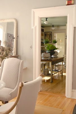
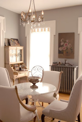
Dave and I have never really been ones for making improvements to a house of any lasting nature. I think we think we're all DIY, yet the first house we chose to buy together had just been renovated and the next was brand spankin new. I'm hoping we're staying put for a while, and because we set aside a little budget to decorate, we decided to invest in some strategic upgrades. Like having an electrician work some magic in adding a chandelier in the middle of all the can lights in the dining room and tiling the backsplash in the kitchen.

I had never seriously investigated tile before, though I do know that the first time I went online to look around a bit, I chose a gorgeous limited-edition gold-leafed tile that retailed for about $200 PER SQUARE FOOT. In Boulder, our friends Amy and Justin did a gut renovation of their kitchen, and when deciding on tile they went for an option more in the $2/SF range, and Amy installed it herself. Our backsplash is 2 feet by 12 feet, and we settled on $5/SF for our budget. I found some tile outlets in Plymouth, MN, and away we went.

And get this: we came home with tile the very same day. You may or may not know Dave and I well enough to know that this is nothing short of a miracle. With no advanced research, we went into the field, visited three stores, and MADE A PURCHASE. Truly amazing.

Here's the thing, though. There are about 3 options for tile in the $5/SF range if you do not want white subway tile. (We are certainly fans of white subway tile, it's just that we needed a little more life back there.) We found these pretty glass tiles in the perfect shade of green, but I was almost positive that I did not want squares.


When we came across a glazed ceramic hex tile for $5.20/sf, it was only a matter of deciding between the smaller and larger sizes and the "moss" or the "milk." I found a birch cabinet in the store, plunked our countertop sample down, and proceeded to stand about 10 feet back while Dave switched samples back and forth. (Sometimes I do this thing where I turn around or go around the corner so I can "walk into the room" and let the material take me by surprise. I swear, it works.) Here's the penny tile from the same line.

(I will also point out that Home Depot had similar penny tiles for twice as much money. Home Depot! And they did not have the fabulous hex.)

And here's Dave with the small moss hex tile.


I loved the moss color, but ultimately felt the larger tiles were better and they didn't come in the greenish tone. Ultimately, viewed from a distance of 15 feet, we realized that the small tile would just read as a wash of color, whereas the larger tile would read as a white wall with a delicately drawn honeycomb pattern, and the answer was clear.

Install is tomorrow.

Related to this. We had been discussing some under-light cabinets, and realized we would have to put them in before the tile, so we scrambled and headed out to an electric wonderland where we picked up some stainless steel 40" xenon lights from counter attack. (get it? clever, no?) THEY went in this morning, and now I can actually see the dishes I am washing!


I never think of these practical things. I'm all: wallpaper! upholstery! let's make headboards! And Dave's all: wouldn't it be nice if these things functioned? Or, it's broke, let's fix.

We make a good team.

Now, if we did it ourselves, that would really be something. But that's the other thing about a nice, brand new house: it makes you nervous to go messing around.

Beautiful Kitchens from Sweden

I have the featured the beautiful Swedish kitchen design firm, Kvänum Kok in the past. They are a high end kitchen cabinet and design firm that is very well respected all over Scandinavia. They have some new designs, which are so beautiful, that I wanted to give you another peek. 
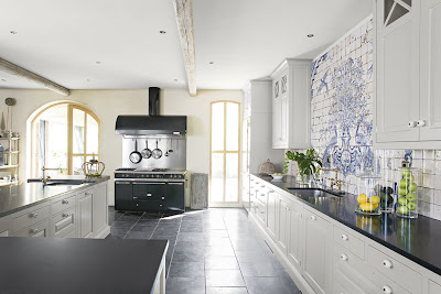
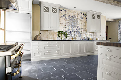
Take a look at this first gorgeous kitchen, with my favorite, white cabinetry. Though I think white cabinetry is the ultimate classic, some may say it is getting boring, as it seems to be featured more and more. This kitchen, though is anything but boring! Several elements take it from ordinary to extraordinary. First, lets look at the cabinets themselves. I have long favored the X cross upper cabinets, and actually used Kvänum Kok as my inspiration for my own kitchen. Read about my kitchen here. Second, I was actually stopped in my tracks by the beautiful backsplash tile. It reminds me of Delft antique tiles. On a wall that has no windows or interesting architectural features, it is amazing how tiles and cabinets can transform a boring, blank wall into the most gorgeous focal point.
Another key to this beautiful space is the wonderful light from the spectacular arched doors. Not all of us are able to incorporate such a stunning feature in our designs, but it is always important to note, how much beauty natural light can bring to a space. Finally the stove is striking. I am in love with stoves that also are works of art and this one is lovely.
Moving on to another kitchen, the one above is part of their newest line. Notice the upper cabinets have been replaced by open shelving. No upper cabinets seem to be a trend worldwide. To read more about this trend click here.
Though the kitchen is not huge by American standards, it is thoughtfully designed, including a freestanding butler's pantry, for extra dishes and glassware. Again light plays an important role with sun streaming in from two sides.
Here is the family room adjacent to the kitchen. Though not part of the kitchen space, I wanted to include it because it is such a pretty room. I love the beamed ceiling and horizontal beadboard walls. Notice the high shelf which acts a bookcase. Also the bleached wood floors which are distinctly Swedish. For more inspiration, read my previous posts on Kvänum Kok here or visit their website here.
.
Finally congratulations Victoria at VictoriaArt -please email your mailing address so I can send you off the copy of Slow Love by Dominique Browning. Special thanks to Dominique for both the book and the wonderful interview which you can read here.
.
(all photos property of Kvänum Kok )

Lessons from a Grand Home

One of the wonderful things about writing Willow Decor is the opportunity to get to know Architects, builders and other designers. Like any master skill, if you look closely and listen to these talented individuals you can learn an amazing amount. Master architect, Tom Catalano of Catalano Architects, was kind enough to send some photos of a house he recently finished. While the house clearly exceeds the price range most of us can afford, reflecting more closely on the design, we can learn a great deal about how to add details and features into our own more modest homes, for a stunning effect. Here is the exterior of the home. Of course it is beautiful, but interesting things to note are the the roof lines and the use of multiple materials. Stone, cedar siding and wood accents and doors are featured prominently. Additionally notice the curved roof lines, copper roofing and copper accents. The cobblestone driveway also adds to the wonderful feeling outside. In your own home try to assess if you can add any one of these features to your existing exterior. A new wood door or cobblestone edging along your driveway or walkway can instantly elevate your exterior.
Of course some things are difficult and expensive to change once in your home- like banisters. But take a look at this entry. The iron spindles add a such a lovely accent to space. Also notice all the mouldings in this area. They are so beautiful. The addition of moldings is another way to add grandness to your spaces.
The gorgeous living room has all the architectural features to make it a showplace: limestone fireplace, curved large windows, beautiful mouldings. Here the mouldings have been painted a soft seafoam, rather than white and become more prominent in the room. Paint is great tool to use to call more attention to a wonderful feature in your room - who could forget the black painted mantel from the movie It's Complicated (photo link here)?
The dining room color echos the living room colors and provides a beautiful flow. Also notice the light fixtures. I love sconces in a dining room. They provide ambient light that can really help create a spectacular atmosphere. Also notice how the beautiful windows are not covered with heavy draperies, but allow the light to flood the room.
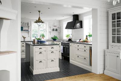
Thea kitchen is an area where details abound: the ceilings are coffered, the cabinets have all the extras, not even the tile was overlooked.Notice the detailed inlay on the cabinet crown moulding and the extended sides of the cabinets. Also of note it is the wood wall moulding which highlights the arched opening into the breakfast/dining area.
I imagine that wall moulding was used to off set this moulding detail entering the family room. The wood trim around the stove hood is interesting. Here is a close up of the tile design. Although the center piece is most likely expensive, the tiles that are not embellished are generally more affordable. Adding decorative tiles in strategic places, can give you an expensive, beautiful look for a reasonable cost. This can be done in your current tiled space, by carefully removing specific tiles and replacing the opened area with something more dramatic. Another doorway with wall moulding that looks into the breakfast/dining area. I really love the raised fireplace. So cozy in the winter. Notice the color of the kitchen ties in nicely with the color of brick. Off the entry, which you can see through the doorway is the library. Who wouldn't love to be surrounded by such fabulous wood and furnishings? Notice the ceiling - a deeper russet than the kitchen. Painting a ceiling in this tone really envelopes you in the room. (Have you noticed I am really into painted ceilings lately?)
Wonderful marble bath with wall mounted faucet.
This house has it all, including a to-die-for mudroom. The beadboard walls are so inviting. I love the branch like pulls. Also notice the floor; the slate is set on the diagonal which will make the space seem larger, and then edged horizontally, interesting details!
Here a back stairway brings you to the second floor. I suspect it is off the mudroom due to beadboard walls. I love beadboard in a newer home. It adds a nice touch by adding depth and a sense of age.
This is an entry to seating area -not sure which floor it is on, but I included it to show the wall moulding detail. It is interesting to me how well the rosettes mimic the kitchen backsplash tile. I love when details of one room are echoed in a different way in another room and this is a great example. Stunning!
The master bedroom is tranquil and beautiful - again gorgeous windows and french doors to private patio flood the room with light. The leather headboard provides a nice balance to the stunning wood ceiling.
Finally the opulent master bath. So much space and light - a dream with private make up area, separate sinks and glorious soaking tub! Small glass shelves dividing the vanity spaces provide privacy and openness at the same time.
.
This house is an exceptional example of classic home design. Though we may never be able to live in such a home, there are many small elements we can take from this and use in our own spaces. Take a fresh look at your room. Can you add some crown moulding, paint the ceiling or the mantel, add some tile? Outdoors can you edge the walkway with cobblestones or create a pebble path in the garden? Small changes can bring big impact. Let me know if any of this inspires you!


(all photos property of Catalano Architects - do not copy without permission)

More of the Maine Beach Cottage

I wanted to share with you more of the photos Jamie Salomon of Salomon Photography, sent to me of Interior Designer, Francine O'Donnell's wonderful Beach House in Maine. Of course the blue ceilings in some of the rooms really caught my eye, but it's the whimsical, vintage decor that kept me wanting to see more.
From dining room above you can see the kitchen (and the beautiful blue ceiling) through the doorway. Notice the fabulous door moulding.
I like the use of the garden table with marble top and a mix of two different chairs. The addition of old chippy garden urns and the crystal chandelier adds to the warm, relaxed feeling.
Here you see a better photo of the table. Adding a thin stone piece on the radiator creates an instant shelf and display area for the owner's garden urns. Painted antique desk continues to enhance the cottage feel.
What an incredible eye O'Donnell has! She truly has a gift for combining vintage objects into beautiful vignettes.
Here is a closer look. Urns, statues, marble, painted tables, iron furniture, distressed mirror!! Fabulous!!
An old stove becomes a table for two antique garden chairs!! So many great ideas!!
Here is a great shot of the dining room looking in from the living room and beyond into the kitchen.
Gray walls continue from the dining room into the living room and provide a great backdrop for the interesting artwork. Clever mix of florals and painted antiques continue the cottage vibe.
Another view shows more vintage mirrors and books.
Another stone piece creates a radiator shelf.
Garden statue brings additional whimsy to this room.
The bedroom has a gorgeous antique iron bed.
Again we see a garden table base topped with stone - I love the artwork.
One of my favorites is this whimsical ampersand "framed" with two vintage frames. So creative!!
Finally the bath with industrial cart holding bath products and towels. Above vintage hand mirror becomes an art piece on the wall!
Francine O'Donnell's Maine Beach cottage is filled with great ideas for bringing a more whimsical flair to your decor!! Thank you Francine and Jamie for sharing this great home with us!