Showing posts with label reader design dilemmas. Show all posts

Reader Design Dilemma: Recalled Crib

Rachel writes to me with a recalled crib.  She doesn't want to use it as a crib or donate it (for safety concerns), but she also thinks it's kind of wasteful to kick it to the curb.  Instead, she'd like to repurpose it.  Here's the crib:


Sort of standard issue, in natural.  (and pictures online are apparently available in two sizes: teeny, and tiny.)

My best idea for this is the most obvious (sometimes the simplest solution is best, no?).  This is a convertible crib, which means it is built to also function as a daybed.  Like so.


I would make a few little alterations and use this, daybed style, as a little kiddo couch.  Cut down the legs, ditch the bumper and replace it with some cute graphic throw pillows, sew a slip cover for the mattress, preferably out of ticking, or make one of these custom boyos a la Lauren Liess's window seat in the DC show house (I love that she stacked three.  So Princess and the Pea),


Or use a pair of floor pillows like I did in my stupendously amazing graphic design job of a mock up

Day bed

(I know, you're super impressed).  Or, heck, just use a cute sheet.

You could put it in a little nook with book bins or a wall mounted book shelf nearby.  Maybe a clip on light on the higher part of the arms.

But maybe Rachel has already thought of this, and would like a little more.

Hoe about turning it into a playhouse?  Kind of like this:


I would use the crib, again, in daybed mode, suspend a hoop from the ceiling, mosquito net style, only instead of netting use some burlap or cotton duck (you know, cheap and durable) and drape it over the side arms, kind of like this.


Or this


(Hey look: ticking!)

Or this (only sideways).


Now, i wouldn't go that themey in an actual bedroom, but how cute to have cowboys and indians fabric, especially if you let it drape over the whole bed,  teepee style?  Like a blanket-and-chairs fort, only better.

Not doing it for you?  How about taking the casters off and using it as a gated step stool in the kitchen.  Like one of these.


Now, I have to admit, these plans are not feeling very creative.  So I did some looking around the interwebs, and I found LOTS of repurposed crib project.  The best round ups are here and here.  Here's the thing, though.  Lots of the projects I came across used pretty spindles from a Jenny Lind-style crib to create all manner of things: table legs, a plate rack, a bench.  Or they use the metal springs from the base of the crib, which, I'll come right out and say it, I am totally against.  This Alpha Crib just isn't that interesting, and I actually do think it's best value is in using it as a whole, not breaking it down into plain old slats of wood or other parts.

Which brings me back to my simplest, obvious solution: daybed toddler couch.

Well.  You guys are more creative than I am.  Anyone out there have a better idea?  Please share it so we can pass it along to Rachel!

Reader Design Dilemma: Repurposing a media unit

First, let me say how much I love hearing from you guys--keep your design dilemmas coming, they keep me sharp.

Lauren writes to me as she and her husband move from a one bedroom apartment in Murray Hill, Manhattan, to a two bedroom in Gramercy Park.  For now, the second bedroom serves as an office for Lauren's booming events business, Bellafare, as well as hosting guests, as needed.  Their old media unit, the Logan Suite from Pottery Barn, doesn't work in their new living room, so she's looking to repurpose it in the office.  Only problem: what to do with the middle bit, where a TV clearly goes?


As I understand it, this unit is modular.  One option that could be pretty seamless: remove the TV stand and tuck the bed right on in there, kind of like this.


At 54" wide, a full sized bed should just fit.  To keep the set up from looking like one of those terrible 80s headboard shelf contraptions that are always showing up on craigslist, I would keep the shelves very styled with a mix of objects and guest-friendly books, and consider wallpapering the backs of shelves and painting above the bed in a coordinating color.  Cute. no?

Another possibility, and perhaps more realistic: to turn the TV stand into a bench.  Lauren wrote that she's inclined to this idea, but I would take it one step further than a simple seat cushion and go ahead and upholster the back.  This is straight out of Candace Olsen's playbook.


(Do you watch Candice Tells All?  This is a screen shot from a recent episode.  You can watch full episodes on HGTV.com, and while the interiors are not always my favorite, I like that each episode focuses on a design principle like "flow" or "rhythm.")

But I digress.  See the brown bench?  that's a black quilted-leather upholstered wall behind it, in the niche.  That's kinda what I'm talking about.

To do something like this, cut a piece of plywood the size of the opening (from bench to bridge), and cut 1" or 2" foam to match.  Adhere the foam with spray adhesive, drill holes for tufting, upholster, and attach to the wall.  )Basically, you're making a rectangular headboard).  Have a cushion made in a matching or coordinating fabric.  A variation on the theme: cover a number of wood "tiles" in matched or mixed fabric to create the same effect, and attach them to the wall with industrial velcro.  (Like this wall in a Muriel Brandolini room--though, to be clear, I would just use one fabric).

Either way, this will look much more built in and custom than a bunch of throw pillows, and will be comfortable enough that guest might actually sit here to put on their shoes or peruse the travel books you've left out on the shelves.

Lauren, hope this helps--let me know what you decide to do!

Reader Design Dilemma: What to do with a brick planter entry divider

Renee writes to me with a fun dilemma.  I'm going to give it to you in her own words, because I think she captures that feeling we all get when a built in element has us stumped:

So there's this thing in my house. It's a brick thing at the front door, sort of delineating the world's smallest foyer from the (also small) living room the door opens into.  I generally love it as a 60's element, I love the color of the brick and now that my kids aren't toddlers it's not as hideously dangerous as it used to be. But what do I DO with it?


Check it out:


My first reaction, to be honest, is that I kind of like it.  But Renee says that this is where plants come to die, and I know that if this was in my house, it would immediately accumulate keys, mail, bags, and Disney princess dolls.

Option 1--and Renee alluded to this idea--is to make it a bench.  At 22" tall, it's about 4" higher than a standard seat. and adding wood on top would just add to that problem.  To make a bench that looks like it came with the house, I would see if the top stone slab could be removed, and replace it with a 1" thick piece of wood with a nice grain in a stain to coordinate with the wood trim.  A 2" thick slab of wood would be in better proportion, but then there's that height issue again.

Option 2: build it up to create a room divider, better delineating the entry from the living space.  To keep it feeling authentic to the house, built in 1962, I would look to a geometric treatment.  Here's some inspiration:


I'm a big fan of this one, because it would echo the horizontal pattern of the brick, and the dowels could make for fairly easy construction while keeping things open.  Now, if Renee didn't want to physically connect the screen to the stone base, today's lightweight materials would allow for a screen hanging from the ceiling, like this:


Though, to be clear, I would stick to a pattern like the one above.

To add a layer of function, the divider could be built out as very narrow shelves, like one section of this guy:


This would provide space for the aforementioned keys, maybe even an objet or two when the kids are a little bit bigger.  Wouldn't this be pretty in a woodstain with some sweet little 60s glazed vases in the openings?

If these options feel either too closed off or too difficult to build, I would consider something with very simple lines.  A horizontal wood slat feels true to the period, but allows the builder to choose just how much space to leave between slats.  Horizontal would be nice:


And, really, so would vertical (love the connecting pieces in this one)


And then there's the possibility of a rope wall.  I spotted this one over at the Brick House, and I love the sort of rustic simplicity of it.  If you check out the blog, there are even basic instructions for the construction.


Problem solved, right?  Well, there's one more issue.  What do you do with that planter?  With the narrow shelves, and the rope wall, the base piece of wood could cover over the planter opening as if it never existed.  Both treatments are open enough on the sides that they wouldn't need to interfere with the light switch on the wall.  The other screens are trickier, because they don't have bulk at the bottom to cover up the hole, while the slatted walls would run right into the lightswitch if they were built down the middle of the stone.  In those cases, I say hang or build them behind the planter (on the living room side), and keep something leafy and green going simultaneously.

What do you think?  what would you do with this brick divider if you really loved it and wanted to make it work?

Renee, I hope this helps!

If you have a design dilemma and would like some help, send it my way at heather[at]heatherpetersondesign[dot]com


Reader Design Dilemma: Solved

Back in February, Sara wrote to me looking for inspiration for a family calendar.  I offered up some commercial products, some DIY ideas, and the possibility of combining them, here.

Well, Sara just sent me a note saying "the calendar nut has been cracked."

Here's what she did:


I love the combination of magnetic surface with a simple, standard paper calendar clipped on, and the little magnetic pencil cup is super smart.

We have a big sheet of metal like this in our pantry, mostly for our spice cannisters, but we also use the bottom portion as a pin board for the week's meal plan, recipes, and coupons for local takeout.


Ours is from Home Depot, and is technically one of those splatter shields that you can put next to or behind your stove.  At $50ish dollars, it wasn't exactly cheap, but it was actually cheaper than having a larger sheet cut down.

You could also use magnetic paint if you didn't want sheet metal, but I kind of like the industrial look!

How do you manage your family calendar?  Anyone else use sheet metal as a magnet board?

Reader Design Dilemma: Family Calendar

Sara is the busy mom of a 2 1/2 year old and a 2 1/2 WEEK old, and she's getting organized. She asked me if I could come up with a stylish and functional solution to keep the family and their new nanny (Sara's sister, who just went back to school and is helping with the kids part time) on the same page with all the shifting details of their lives. She wanted something where she could see at least a month at a glance, with each day's square spacious enough for information about trips, classes, and other engagements, and preferred something erasable. Or, i suppose, re-writable. I found a couple of good options for Sara, readily available for purchase, depending on her use priorities.

My first assumption: no large scale blue and white laminated office-style calendar for this family.
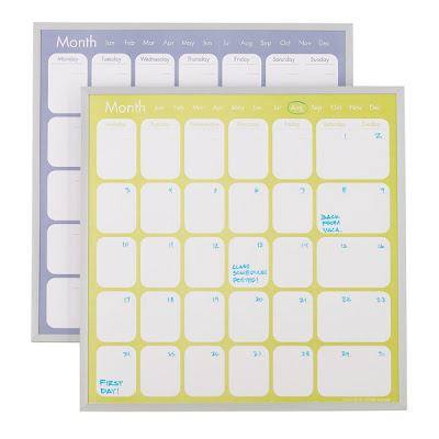
I did find one not-too-terrible update on that old favorite, this magnetic monthly calendar from The Container Store. It's a perpetual calendar, making it reusable month to month, it has a white board, and it comes in lime green--on my screen, it looks more chartreuse, and Sara is nuts about anything in the green-yellow family. It's only $19.99, and with that simple frame (which could be painted if that brushed nickel wasn't working in the room), it looks like something that belongs on the wall. Nice, simple design, all the requested function, presentable.
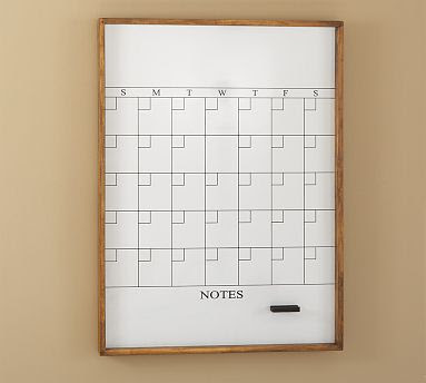
For a more rustic-modern look, Pottery Barn offers this vertical whiteboard with a simple font and frame and extra room for notes. While it's nice looking and quite presentable, it's a bit pricey for what it is, ringing in at $199.


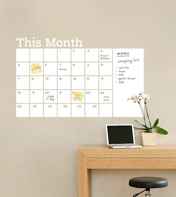
At the other end of the spectrum, I'm loving this frameless whiteboard vinyl decal. So clean and modern! And you could post two or three to get a look ahead at the coming month, if you so desired. $74 a piece.


Speaking of simplicity, if Sara is willing to draw in the grid each month (I'm already guessing this is a non-starter), CB2 has the ultimate in simplicity: a modern teak dry-erase board. Lovely material, literally blank slate. $59.95.

Of course, for one willing to go to that trouble, a blank whiteboard would do, and could be customized any number of ways. Magnatag has a ton of combinations of white board and cork board in every imaginable size, with different wood frames and tack board colors. Functional and practical, but perhaps lowest on the old style-o-meter.

Year at a Glance
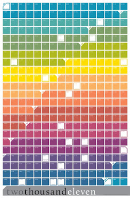
Now, if a year-at-a-glance is more the priority, I love this one, available on Etsy for $32.99. It reminds me of a project I kind of always meant to do with left-over paint chips, and I love how clean and modern it is.


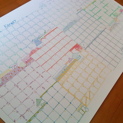
For a more whimsical space, I'm dying over this one, which appears to be hand-drawn and is only $27.


Neither had the erasable functionality that Sara prefers, but neither is a perpetual calendar, so all those scribbles and changes would just go out with the calendar. Or of course they could be laminated and framed, but that's a lot of work for an impermanent thing.

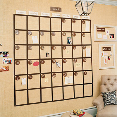
So what do I think Sara should really do? Modify this awesome wall calendar from Southern Living.


They made theirs by wallpapering grasscloth over a cork wall, which is kind of going all-in. Then there's the problem that you can't write on it. But you could get the same dramatic effect, with improved functionality, with a little bit of paint. Here's what I would do:

1. Measure the overall dimension of your calendar (depending on your wall size, but the bigger the better, especially for a year-at-a glance), and paint it with magnetic paint.

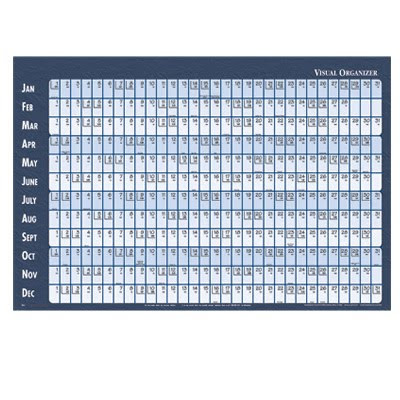
2. Use narrow painters tape to mark off your sections. For a month calendar, follow Southern Living's tutorial. For an annual calendar, I would use the linear style like this:

3. Paint chalkboard paint over the whole area. Be traditional with black, choose a fun color, or go wild and make stripes for the months in the linear year. Hudson paints offers two dozen colors, including--you guessed it--chartreuse.

4. Allow the paint to dry, and pull off the tape. You will be left with a grid of squares.

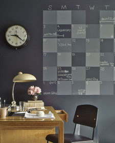
(An alternate version, offered up by none other than The Martha, differentiates the grid by using subtle variations on the same color. Find the tutorial here.)


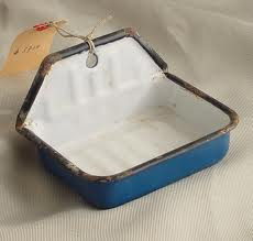
5. Screw a cute soapdish or pencil cup to the wall for your chalk and erasers. I love this vintage enamel soapdish--so unexpected. But there are plenty of modern pencil cups that would be a bit more coordinated and streamlined, too.


6. Start recording important dates! (My birthday is December 10th, but then, Sara knows that because I share it with her husband.)

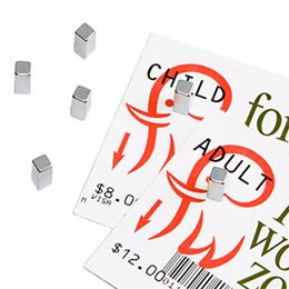
The thing I love most about this strategy is being able to corral important date-sensitive items right to the date they are sensitive to. Tickets for a concert, a flyer about the preschool open house, even coupons can all get tacked up right where you need them. For my no-thumb-tack version, I would recommend mighty magnet pegs--tiny enough so they're not in the way, strong enough to hold what they need to hold, and long enough that you can actually pick the things up.


I'm sure there are a zillion creative ideas out there--anyone have another solution for Sara?

And of course, if you have a specific design dilemma, send it my way. heatherjoypeterson[at]gmail[dot]org.