Showing posts with label wall treatments. Show all posts

Super SUPER size me

I wrote about ovescale botanicals last week.  When the new issue of Lonny was delivered to my inbox tonight, I noticed a project that took the concept to another level.  (Or "a whole nuther" level, as those old Domino's ads would have said.  Anyone remember those?  Anyone else really bothered by them?  How about my penchant for tangents as of late, how are we feeling about that?)

Behold.


Do you see what's going on there?  Designer Jarlath Mellett created custom wallpaper from his own photography writ large.

What do you think: yay or nay?

I think I'm partial to the two that have been quite abstracted--the gossamer tree on one wall of the living room (bottom image) and the sun-spotty branches behind that tan leather headboard (up top).  The others may be too literal for me, but perhaps I'm too much of a traditionalist at heart, and abstracted florals have been making their way into wallcoverings for about as long as there have been decorative wallcoverings (Lascaux?).

Oh, and check out the new issue of Lonny and let me know what you think.

Size matters

Yesterday I mentioned my desire to cover a wall or two with a large-scale hand-made wall treatment, and did a little round up of the first of two trends I'm finding myself drawn to: the large-scale graphic pattern with hand-painted appeal.

The second trend can be summed up in just one word: overscale.

I've been seeing a number of interpretations of this huge Moroccan pattern around blog-town.

 [here]


And I like this more delicate version, from hgtv


Which kind of makes me think of this beautiful trompe l'oeil mural of picture molding, which is not the same but feels related, somehow.


While we're talking delicate, I recently re-found this image, an old favorite from House Beautiful, and I'm loving the giant graphic, but especially the movement in it.

[House Beautiful]

Of course, scale has been used lots lately to punch up the power of stripes, and, unsurprisingly, I'm liking giant painted chevron and herringbone, a la the painted floor by Mary McDonald on this week's Million Dollar Decorators (which I don't watch, lacking Bravo, but recaps of which I find highly entertaining here, here, and here.)


The mix of colors here, and particularly the color gradient of pinks and reds, feel far more interesting than the two color zig zags that are everywhere just now.  Another way to set it apart?


Herringbone.  I love how the added borders here make this feel so sophisticated.

Hmmm....I felt really energized writing yesterday's post, and I'm kind of boring myself now.  As lovely as these options are, it must be more proof that the all-over graphic from yesterday is the way to go.  Unless....


Hmmm.....

Now I have a dilemma on my hands.

What do you think?

Loving Graphic Wall Treatments

So, you may have noticed that stencils are kind of a trend.  Probably because wallpaper is "back in a big way" but not super affordable.  (I'm not quoting anyone directly there, by the way, it just feels like I've heard or read that phrase a gazillion times in the past year.)

I have two big walls that offer up molto opportunities for some creative stenciling--the laundry room upstairs and the back wall of the office--and I'm just now discovering a trend in the designs I'm drawn to.  Okay, sort of two trends.

It kind of all started with this image, seen in a sneak peek on design sponge and ohdeedoh (which came first?  Who can say).

[here and here]

I love the effect of the overall triangle pattern, which the homeowner drew and painted by hand.  And I found myself having the urge to do something similar with a hexagon shape, like the bigger, more colorful cousin of the backsplash we added to our kitchen.  Kind of like a painted version of this.


I love the more limited color palette in this one, and the way it is so hand made yet almost feels digital in the color gradients.  I also like that the pattern does not go all the way to the edges.  Cool, right?

This next one uses simple squares, but ramps up the interest by using gradient colors.


So pretty.  This is from Dwell Studio, and I am remembering a similar wall treatment in a loft that, I believe, belongs to Christiane Lemieux, though I could be wrong.  I can picture the living space perfectly--maybe it was in Elle Decor?  Anyone?  (But I digress.)  Also, I wish I could be okay with this bed being nowhere near centered on the wall treatment, but I'm not.  Call me rigid.  I won't argue.

Anyway.  Then I saw this one on Apartment Therapy last week, in a house tour.


Which feels really hand made, and also does the work of a wallpaper while celebrating its stencil-ness by stopping short of the edges of the wall.  Here's a detail.


And then today on Apartment Therapy I saw this fabric stencil project, which similarly shows its hand.  I would love this on a wall.


And just to throw something vintage in there, because you know I love to look on back to the good old days, I found this.


This treatment is made from wood, which is awesome, but I can also see painting a tone on tone pattern to create a similar optical illusion.  I love the geometry of this, but the overall effect is kind of quiet.  Which might be a good thing.

Or, how about doing the opposite, and going kind of loud?


Did you ever play that drawing game where you create a shape, draw a point in the corner of the paper, then draw lines from every corner of your shape to the point, to create a 3-d object?  No?  It's fun.  This painting kind of reminds me of that.

So it appears that I need to tackle the office and/or the laundry room with a large-scale, overall graphic pattern that feels hand-made, whether hand painted, stenciled, or block-printed, and that it should perhaps use gradient or tone on tone color.  Sound good?

So that narrows it down.  Guess I'll get designing!

Oh, but there was that other trend emerging in my inspiration files.  Come on back tomorrow and I'll round it up.


Riveted

Well, that was more of a hiatus than intended.
Blogger issues + personal computer issues = 4 days off, plus one late post.

But here I am, ready to say that I have always been quite taken by Phillip Jeffries wallpapers, and while it is usually the Voyage collection that I drool over (hand block-printed natural textured wallcoverings), I'm kind of digging the harder edge to the new line, Rivets.


I love both the different metal finishes and the textural backgrounds, but it is a lot of look.  Instead of all-over rivet madness, how about just a finishing detail?

I love the nailhead trim along the ceiling line in this room by Joseph Minton.


Okay, there's lots of cool stuff to see in this image, like the amazing crown molding in the hallway and the details on that mirror.

Come closer.

There it is.

These walls (and ceiling) are upholstered, making this trim a good way to finish the seams, but you could simply trim out painted walls in a coordinating trim, and finish with overscale nailhead.  What a nice way to bring an edge to your walls, especially if you don't have moldings.

Of course, I'm still dying to upholster a room.  Or at least my guestroom ceiling.

See you tomorrow!

Flashback Friday: The Tree

Okay, so I'm kind of going off-script here. I don't have an actual picture of the room I'm flashing back to, though I wish I did. Instead, I have the picture that made me go flashing back in the first place.


[Elle Decor]

Gorgeous, right?

My senior year in college, I lived off campus in the bottom floor of an old Victorian house. there was a kitchen and a bathroom, and the original living and dining rooms were the two bedrooms. To close off the archway between these two rooms, the owner had installed two tall panels--maybe sheetrock? on either side, and installed a door in the middle. The panels were in my room, and one of them tucked nicely behind a carved teakwood screen I had picked up at a yard sale to close off the "closet". But the other panel was an eyesore. I knew I couldn't hide it, so I would have to embrace it--make it into something.

I had studied Japanese art and the Japanese influence in late 19th and early 20th century European art the previous semester, so off I went to the library to look up some of the gorgeous Art Nouveau ineriors I remembered so well.

Based on my reference, I painted the panel a plum color, using a drag technique. Then used silver metallic paint to create a swaying tree trunk and long graceful branches, and a set of hand made potato stamp--so high tech!--to make the cherry blossoms from white and two shades of pink paint. While it certainly did not have the craftsmanship of the screen in the Elle Deco spread above, it had a similar effect.

I was so proud of that mural. I was a writing major and even wrote it into the apartment of a character in one of my stories. I wonder if it's still there, or who chose to paint over it.

Do you have fond memories of early ventures in DIY? Any projects that bring you back to a place and time? I'd love to hear about them.

Just goes to show

When I was posting Danika's flashback on Friday, I found myself thinking that her "huh?" moments looked pretty good to me. In particular, she pointed out this checkerboard wall as a predominant "what was I thinking?" choice in her awesome carriage house.

Last night, I was looking through an old folder of tearsheets, and I found this.


[Elle Decor]

It's a bedroom by my very favorite designer Muriel Brandolini.

While I still (and always) think you should just do what you love in your home regardless of what other designers are doing, this just goes to show that one woman's "ugh!" might be another woman's "ahhhh," and that we tend to see spaces we have designed differently than other people will. We see the work that went into it, and all the flaws. Or maybe I should say "flaws."

Seeing this image again, I still feel inspired by the combinations of textiles and lighting--ornate with streamlined, fanciful with crisp--and while our tastes change, the way we combine things we love can continue to energize them and make them new.

Continent wall treatment: How To

After sharing a sneak-peek at Oliver's nursery last week, I had a few people ask about how we ultimately decided to go about painting the continents. This tutorial will probably be boring to some of you, but I promise I'll be back with something fun tomorrow: a reader design dilemma about mixed-gender shared kids rooms. Good stuff.

First, I should say that Oliver's parents finally decided to go for the map treatment we had been considering after I showed them a picture of Max's room, over at Janell's blog. They could finally visualize it in a room, and with the more neutral color palette we decided to go big and use all the walls, not just the alcove.

Okay, so I considered a number of options before we proceeded paint. I thought freehanding the maps would be fine (I'm such a dork, I used to draw freehand maps for fun), except we were doing all the continents, on sloped walls, and I thought the overall perspective would get off if I made it up as I went along. Next I considered using that trick where you draw a grid over your image and draw a corresponding grid on your wall in order to keep your perspective in line, but I didn't want to deal with erasing the grid lines from the original wall color. Plus I wanted to get a sense of the placement before I made ANY marks. The whole thing became much simpler once I decided to just go ahead and invest in a projector. (Believe me, I can see many uses for this thing!)


After reading lots of reviews, I chose the tracer from artograph because the viewfinder window is 5 inches (meaning, it can project an original image that is 5 x 5 inches; lots could only do 3", which really isn't very much) and because it could enlarge that image up to 14 times. Since I knew I was planning on continents that were several feet tall, this was completely necessary. Also, it was reasonably priced. They go for anywhere from $49 into the $80s, depending on where you buy.

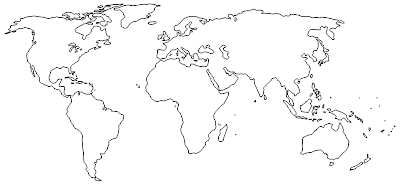
To get my map source material, I did a google image search for "world map outline," knowing that it would be simplest to deal with a single, strong outline and not something more detailed so I wouldn't have to figure out what to keep in and what to leave out as I was tracing it to the wall. I found a few that had the right level of detail to the outline and the right shape on the page (some were more slanted than others, especially North America.) One weird word of warning: lots of map sites seem to carry viruses, so my Norton was pretty busy.

Once I had my images, I just copied them to be a full page on standard 8 1/2 x 11 paper, printed them out, and, where necessary, drew over the outline with a fine-tip marker to make it bolder--the projector is not all that powerful.


The projector called for a REALLY dark room, and we did end up taping cardboard over the windows. I played around until we found the right size and placement on the wall, propping the projector on a box, propping the box up with books, and moving the whole contraption closer to and farther from the wall until we got it just right. It's a good idea to tape the picture down to your surface and mark the projector's placement on the paper--just trace around the corners of the projector with a pencil--because the thing can definitely slip. I learned the hard way that trying to realign the image on the wall is nearly impossible.

Once all of that preparation was done, I simply used a pencil and traced the outline of the map right on the wall.


That's florida.

Next, we used a mini foam roller and some wide, flat artist brushes to paint in the continents with our main color--a no-VOC paint in "Coastal Sand," which seems quite fitting. The paint was regular latex interior housepaint in an eggshell finish, same as the walls. We gave it two coats. This was easy but time consuming.


There's Australia, all coastal sandy.

Finally, we came back in with a dark brown paint to edge everything out. I used a brush from my kids' watercolors (we have plenty of extras from used-up paint sets), and cut it down by half or more so the bristles would be firm--before I did this, I found that some of the bristles went rogue and gave a sloppy line. I was able to adjust the level of detail to the edges in this step for the best effect.


And voila, Australia and assorted Pacific islands.

So there you have it. As with so many things, the better prepared you are, the easier the project will be.

Oliver's grandma is finishing up one final sewing project for the room and bringing it up next weekend, so I should be able to share the final "after" next week. It's looking good, and we're excited!

A sneak preview....

We decided to go with a map treatment in Oliver's nursery. I just finished yesterday and my 4 year old said "ohhhhh....awesome."

Here's a sneak peek ....


(finished in the evening--bad lighting!)

Can't wait to finish up in there.

Textured Wallcoverings

So. The dining room accent wall. There was a months-long search for just the right wallpaper, but meanwhile I made other decisions. Ceramic hex tile for the kitchen backsplash. A graphic chevron runner from Nate Berkus for the kitchen floor. A huge chandelier. All that bold, graphic pattern changed things, and the accent wall can no longer take on a pattern. It needs texture. Warmth.

In a word: Grasscloth.

I've always been a fan. And the blogosphere is burning up with its triumphant return. And I will probably go with it--maybe in a metallic for a little bling, though maybe in an olivey green close to the curtain color to enclose the room. Rummaging through some folders tonight, I came across a stack of images that had been misfiled; apparently this is not the first time I have had textured wallcovering on the brain.

Behold.

A faux-leather treatment, unexpected in green.


[via House Beautiful; design Nestor Santa-Cruz]

Farrow and Ball drag wallpaper, in yummy colors.


[all images House Beautiful; Design: Jean-Louis Deniot]

Raffia. More structured than the grasscloth, less "strawlike" (my husband's term. Do you think he is pro grasscloth, or against?)


[House Beautiful; design: Jean-Louis Deniot]

Phillip Jeffries Zebra Grass.


[House Beautiful; design: Thom Filicia]

And--oh, okay--grasscloth. In the most gorgeous blue. Maybe this is why I've also been lusting after blue grasscloth (in lieu of paint) in the guestroom.


[House Beautiful; design: Peter Frank]

Gorgeous.

Airing My Dirty Laundry

You know how sometimes you just stop seeing a mess that is right in front of you? (Much harder when you're blogging, let me tell you! Any time I go to take a casual picture, the dust, or stains, or crumbs, or toys all come into sharp focus). And then sometimes, all of a sudden, you can see it again?

That's what just happened to me with my laundry room. It's upstairs, and most of the time I'm downstairs, except when I'm putting the girls to bed and then it's dark. Well, I just went up there to get something, and walking by the open door, I saw this.

Oh my gosh. Can you believe I just shared that on the internets? It's appalling, I know. Especially since we actually have space in there, both surface and storage. And because my laundry rooms have typically been in the unfinished basement (or, in Colorado, in the kitchen), I've never given much thought to decorating them as their own space. But the blogosphere is doing it. Yup, you can follow Nicole's very nice basement laundry room redo on Making it Lovely. Pretty soon, I think Jenny will share an after, possibly based on this inspiration photo. My laundry room is getting an inferiority complex.

Suffice it to say that there will be no major renovating--the fixtures, cabinets, etc are new and coordinate with the rest of the house. But there is this Nice. Big. Wall.

And the room is sort of tucked away and private, which to me means it can be more personal, less finished than other parts of the house. I have two thoughts on what to do here.

One would be to wallpaper with one of these awesome "frames" wallpapers and use it to tape up family photos (we're not much of a family photo kind of a family, and I think it would be nice to incorporate more snapshots somewhere.)


[via Home Workshop; paper also available from Urban Outfitters]


Come to think of it, I could make my own stencil or free-hand paint frames on the wall for a similar effect.

The second idea comes from that magazine stash from my Mother in law. Her son, my husband, happens to be a collector of T-shirts, and, as a T-shirt kind of a guy, he wears a lot of them. But he also has a vintage collection that is no longer fit to wear, but too "good" to get rid of. I love this idea to stretch them over canvases (or stretchers) of equal sizes, and hang them in a grid covering this whole wall, like they did in My Home My Style, only to the max.

Like, maybe 5 high by 6 wide?

Kind of like a new take on those LP-covered walls that you may or may not have had in college, depending on how much younger you are than me. When I asked the hubs how he felt about this, his response was "t-shirts in a laundry room. Well, I guess that makes sense." Which was a greater vote of confidence than I sometimes get for my hare-brained schemes.

I have to price out stretchers to see if one of these projects is vastly cheaper than the other, but if it's all kind of same same, let me know which you like more, and we'll see if I can get sign off from the CFO.

Oliver's Nursery: The Alcove

I met with Oliver's mom this morning to move forward on his nursery. We're all systems go, with one big change: out of safety concerns, we will be nixing the striped tenting plan for the crib alcove and returning to the original idea to do some kind of map treatment. Here's the alcove again.


The alcove, while not huge, is bigger than the largest non-custom world map murals out there, which clock in at 13' wide by 8'8" tall, so we won't be able to simply wallpaper the space with a pre-existing mural. While I did find a place that could custom print a vinyl, pasteable world map for me, my required dimensions would result in a pricetag of a whopping $1500, and since that's about 3 times the budget for the ENTIRE ROOM, we'll be taking a pass.

After a little research, I presented two options, each with variations.

1. Wallpaper.
To treat the alcove to an all-over effect, we could use this wallpaper of nautical charts, and go ahead and hang it like any old wallpaper.


Or we could pick up a slew of vintage maps and paper the walls in a random, overlapping pattern, like these creative folks did.


I think the overall effect would be an alcove that felt like it had a sort of color wash from afar, with all the delicate details showing up when you came close up. Lovely.

2. Giant continents.
The other option as I see it is to create overscale continents, with the Americas on the left wall, Africa on the back wall, and Europe and Asia on the right wall. The overall effect would be more graphic and punchy than the wallpaper plan.

I see three possible looks.

- we could use a topographical map and blow up each continent, print it and decoupage to the wall. I would make a mock-up of what I'm thinking in photoshop, but the hubs is just teaching me how to use it, and so far I've learned to cut items out and build layers, so there's a LONG way to go! Just use your imagination....

- we could create a map "silhouette" with custom vinyl decals or paint, for an effect kind of like this turquoise tapestry from Urban Outfitters or this Orange World poster from allposters.com.


Or we could cut them out of vintage wallpaper, like those cool animal decals.


- or we could go kind of old school and just paint our own custom mural. (Note to self: find a picture of Mom's murals, either from the California house int he 70s or from my brother's Sesame Street bedroom, for a Flashback Friday).

For this, I like the kid-friendly aesthetic and color palette of something along these lines.

I'm super excited to tackle any of these projects, and can't wait to see what Oliver's parents choose.

Do you have a favorite? I'm so torn!